
Using a raceway reduces the amount of penetrations into the façade of a building which is ideal for a more commercial environment (higher turnover of tenants, etc). The letters are attached to the raceway that houses all of the electrical wiring, power supplies, etc. The raceway is then attached to the building. Typically you want to paint the raceway the same color as the building so that it blends in as much as possible and the letters stand out sufficiently. In the example below, it’s hard to see the raceway because it matches the façade of the building…just the way we like it!

This method leans toward a more clean or architectural appearance. Here, the letters each have multiple non-corrosive fasteners (or studs) that are attached directly into the face of the building (or ceiling like the example on the left. All electrical is run inside the building, or wall, where the letters attach. Accessibility to this space is imperative for future maintenance. If your client does not have access then a raceway is probably the way to go.
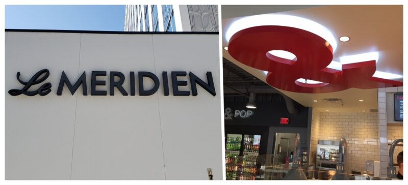
Another more architectural look is when channel letters are attached to an oversized backer, monument, or cabinet sign. Electrical and power supplies are easily hidden in the oversized backer. Installation is a bit simpler with less perforations into the façade of the building and access points are a bit easier for future maintenance.
Solid blue letters do not illuminate the best at night. If you must use blue, or a similar dark color.
Here’s 4 ways to achieve success with blue:
1. Use perforated vinyl on acrylic for the face of the letters. This allows a dark color during the day then illuminates white at night (see tigerhawk example below).
2. Use a white keyline around the perimeter of the faces with a minimum of ¼” to have a nice white outline to the blue.
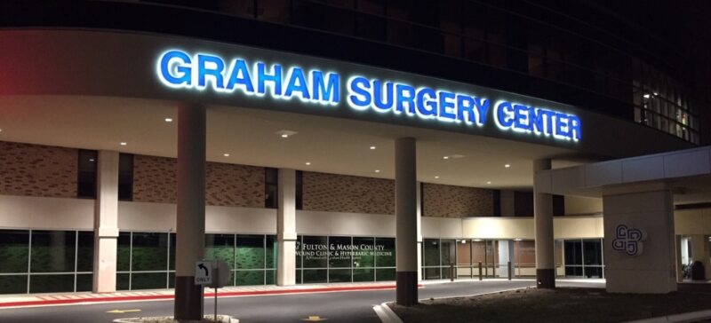
3. Stand the face lit blue letters off the backer and back light with white. This is the a nice look but costs a bit more with the added illumination. This method is shown in the Graham Surgery Center example below.
4. Don’t use blue. Use white, always use white.
These can use a lexan or acrylic face dependent upon the size of the letter. There are many choices out there for vinyl overlays, most only allow for <1% light transmission so color selection is a vital component. If the standard array of colors that are offered do not match what you are after, you can also print a specific color.
Dual film is also very popular and has a warranty that fits the quality of the product. Using a dual film you are able to achieve the color you want during the day and white illumination at night which is optimal for visibility.
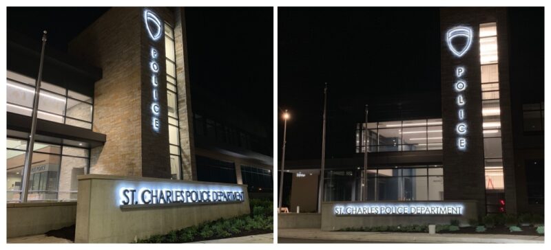
This type of illumination is best for direct mounted applications. Backlighting is a great way to illuminate unique shapes and letters. Keep in mind, some substrates such as brick do not distribute the light as well and a fabricated backer or oversized cut aluminum letters may need to be used. Lastly, a shiny surface may enhance the lighting so much that you may be able to see some of the LEDs reflected upon the wall. Using a matte paint finish is imperative when using LEDs to reduce any visual “hotspots.”
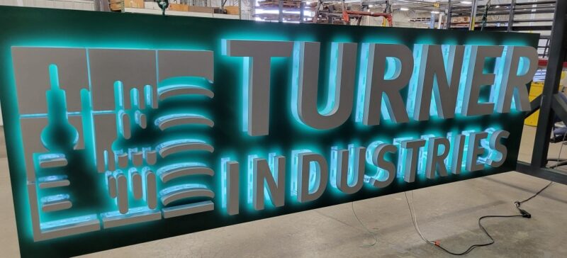
This is a unique way to make your logo pop, especially if you’re dead set on a color (other than white) for your letter illumination. This is also the ideal way to use blue if it is part of your branding. This method is a great and highly visible solution, but consider that the cost is a bit more with having twice as many LEDs for illumination.
There are many different options available in today’s market. LEDs are by far the most popular. ImageFirst typically uses quality LEDs from Principal LED, but any specified LED, (brand), color temperature, or RGB system can be utilized to match your project needs.